Hackett's Information architecture
Information architecture is one of the most important aspects in terms of accessibility, SEO, and conversion. From the business team, there was a real need to optimize Hackett's information architecture and implement a new redesign of the navigation.
- Date: January 2022
- Skills: Information Architecture, UX/UI

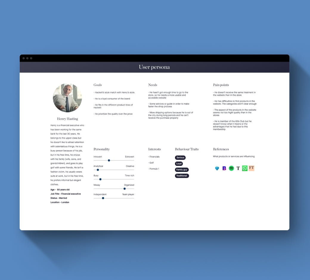
To start facing the project, the first step was to define who we are as a brand and what values are connected with the Hackett London concept, in addition to knowing who our users are and how they interact with the brand. For this last aspect, we built a user persona.

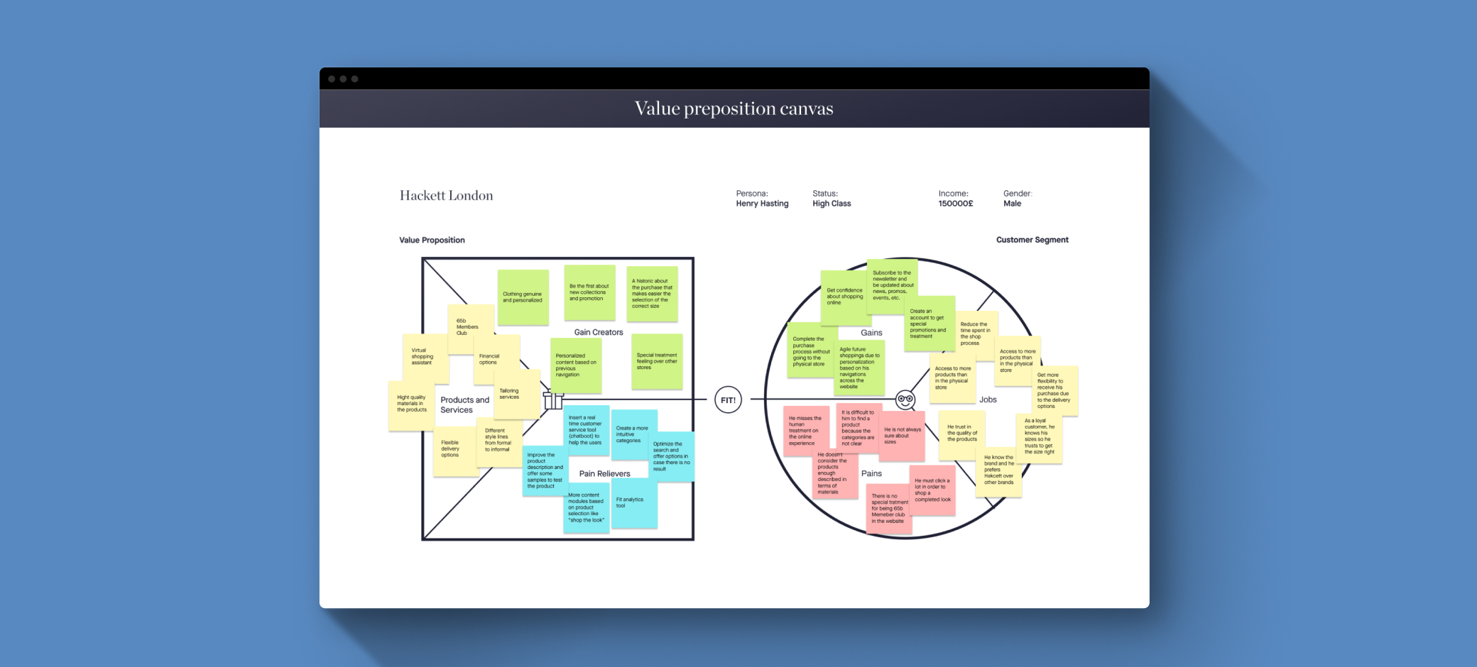
Taking into account the business part and the user part, we developed a Value proposition canvas. From the user's side, we tried to better understand the customer, their habits, problems, and behaviors, while on the business side we focus on providing a product or service that can offer a solution to your particular task or activity, alleviate your annoyances and frustrations, and provide you with joys and benefits.
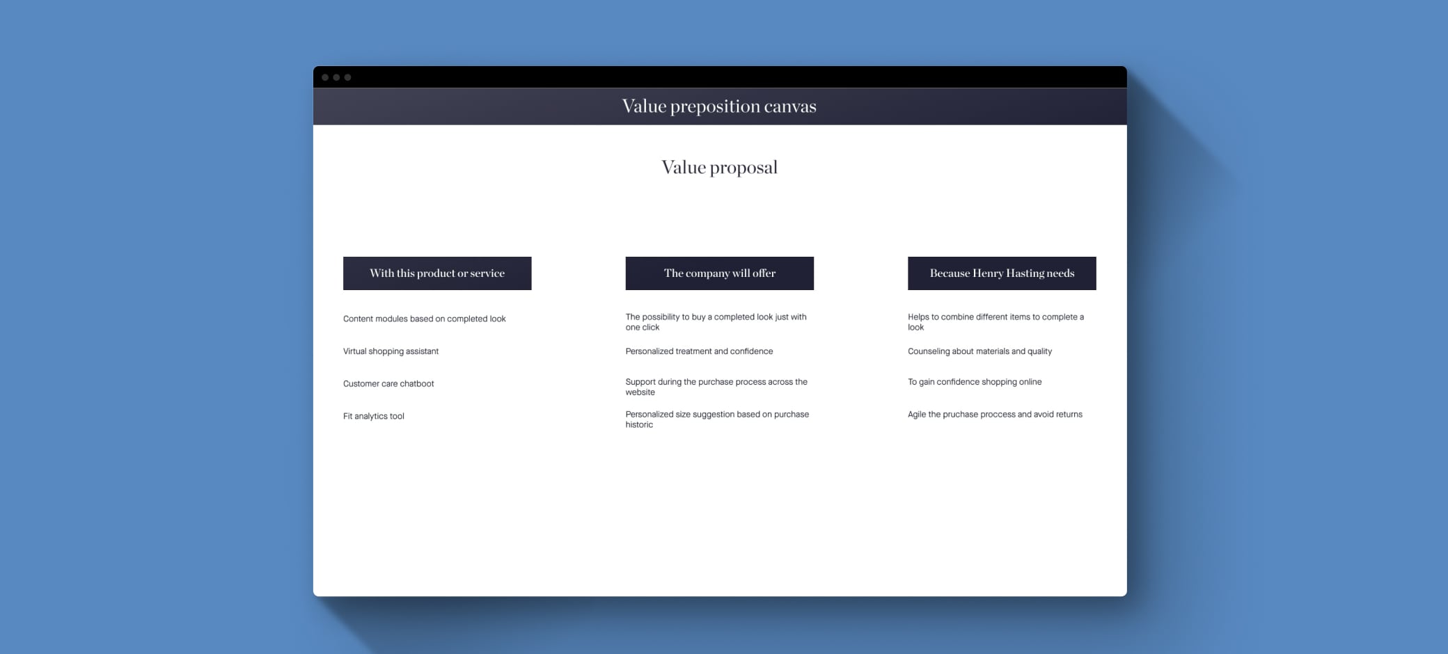
With all this analysis we recollected the main value proposals.
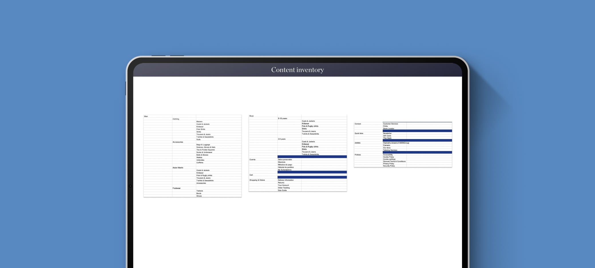
After that, we started with the content inventory of Hackett's website in terms of information architecture. The point here is to build a list of categories, subcategories, etc. in order to have an overview of all the content and prepare it for some user tests.
To optimize the information architecture from a user-centered perspective we made two kinds of tests: card sorting and tree test. With the card sorting test, we wanted to check if the categorization given by the catalogue team was intuitive for the user and if it was needed to create some new categories. For that reason, we proposed and hybrid card sorting. we also asked them to rank the decision factors when they are shopping on the website.
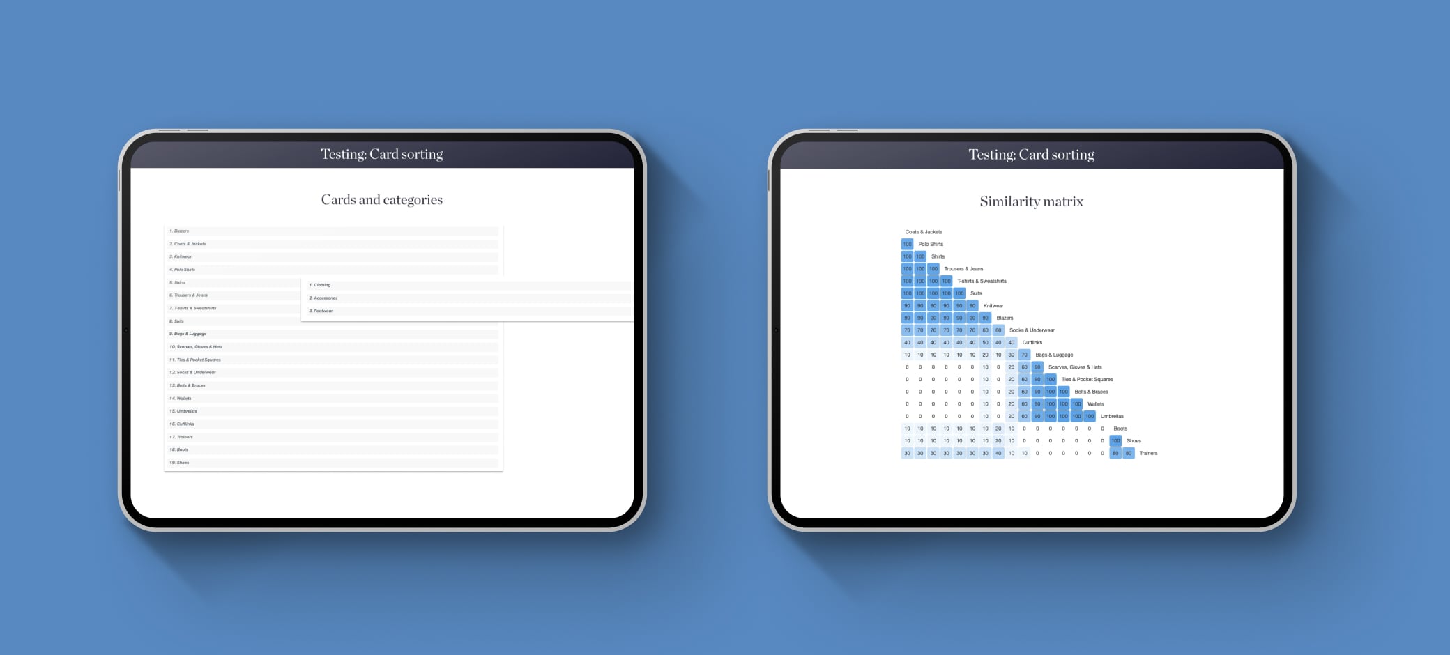

After the card sorting test we got the following conclusions:
- Categories as Clothing, Footwear, and Accessories are mostly recognized by users.
- Socks and Underwear subcategories match better inside clothing category than in accessories one, in where is it currently.
- Price, Picture, and discount are the more relevant decision factors to users to buy an item.
With the tree test, we wanted to check if the hierarchy of categories and subcategories, and the navigability were clear enough for users.We propose two task:
- If you want to find denim pants for adults, in which category would you go?
- If you want to find some outerwear pieces for kids, in which category would you go?

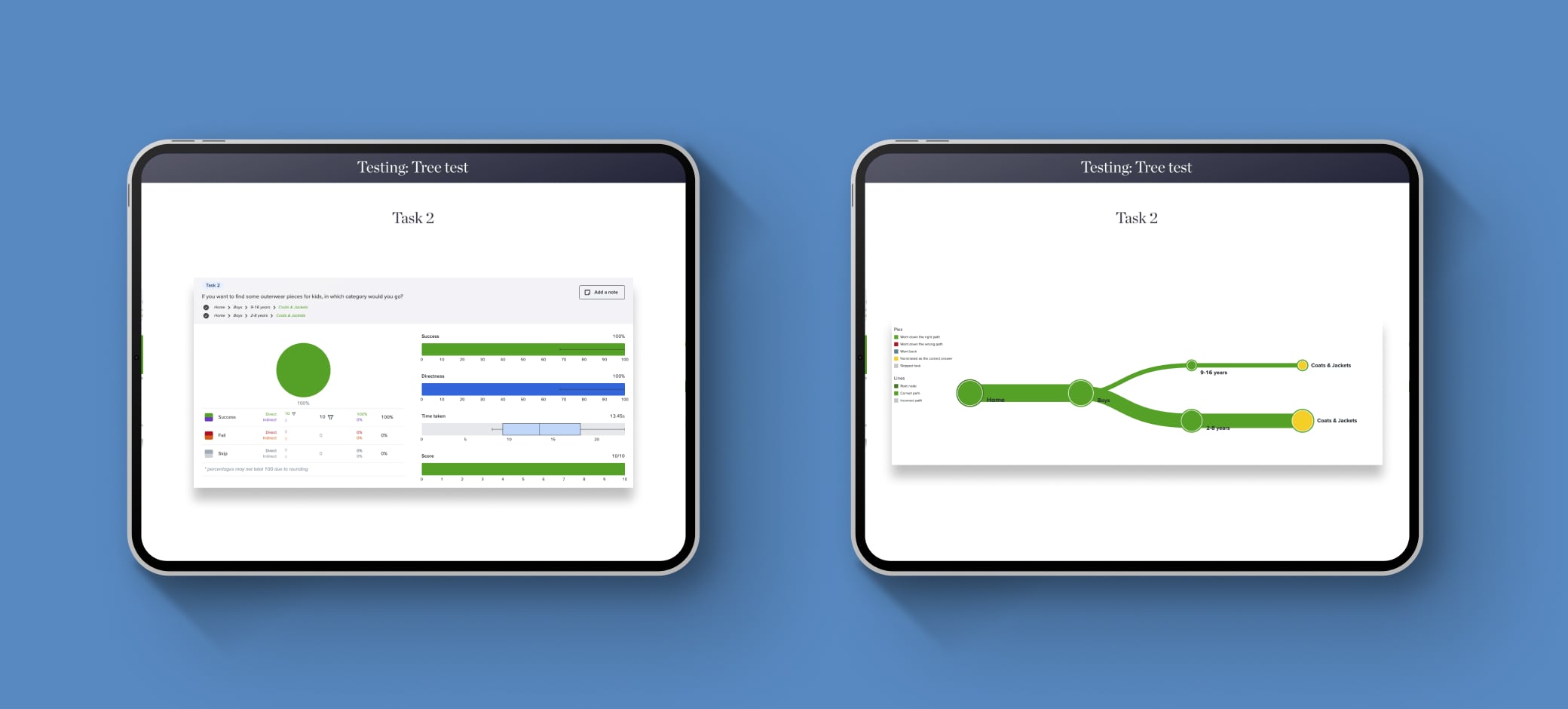
After this test we get the following conclusions:
- The division by Trousers and Jeans in different categories can be confusing for the user and It is not relevant for business because there are just a few jeans by collection, so we decided to keep it as Trousers & Jeans category.
- The division by age in the main Boys navigation is not useful for the 60% of user and It is confusing when they are searching for a product kids collection. We decided to use the age/size as a filter instead of a category.
According to the results and with the business goals we propose a new information architecture focusing in the product catalogueue part and working hand by hand with the SEO team and business team. These were the requirements:
- Hightlight the man main catgeories because the most of the traffic are related to man (not boys).
- Keep the Boys category as a second-level category instead of a primary one. The Boys category are not too relevant to keep it as a main gender one.
- Socks and Underwear should belong to the clothing category instead of accessories.
- Aston Martin partnership is a main bet for the business and the collections should be highlighted.

The last part of this project was to redesign the main navigation of the site. We were working hand in hand with the business, catalogue, and CRO teams to find the best solution for this challenge. This is how looked the legacy navigation:
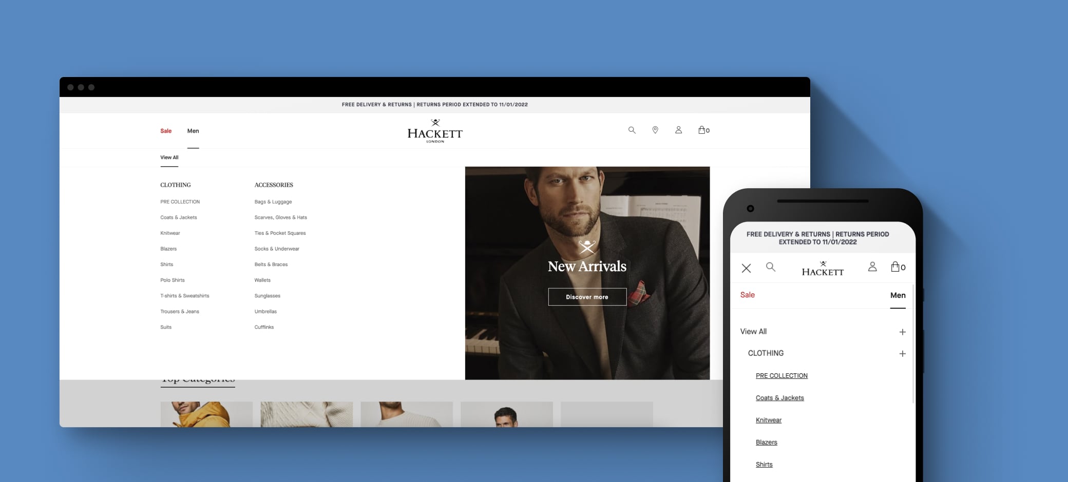
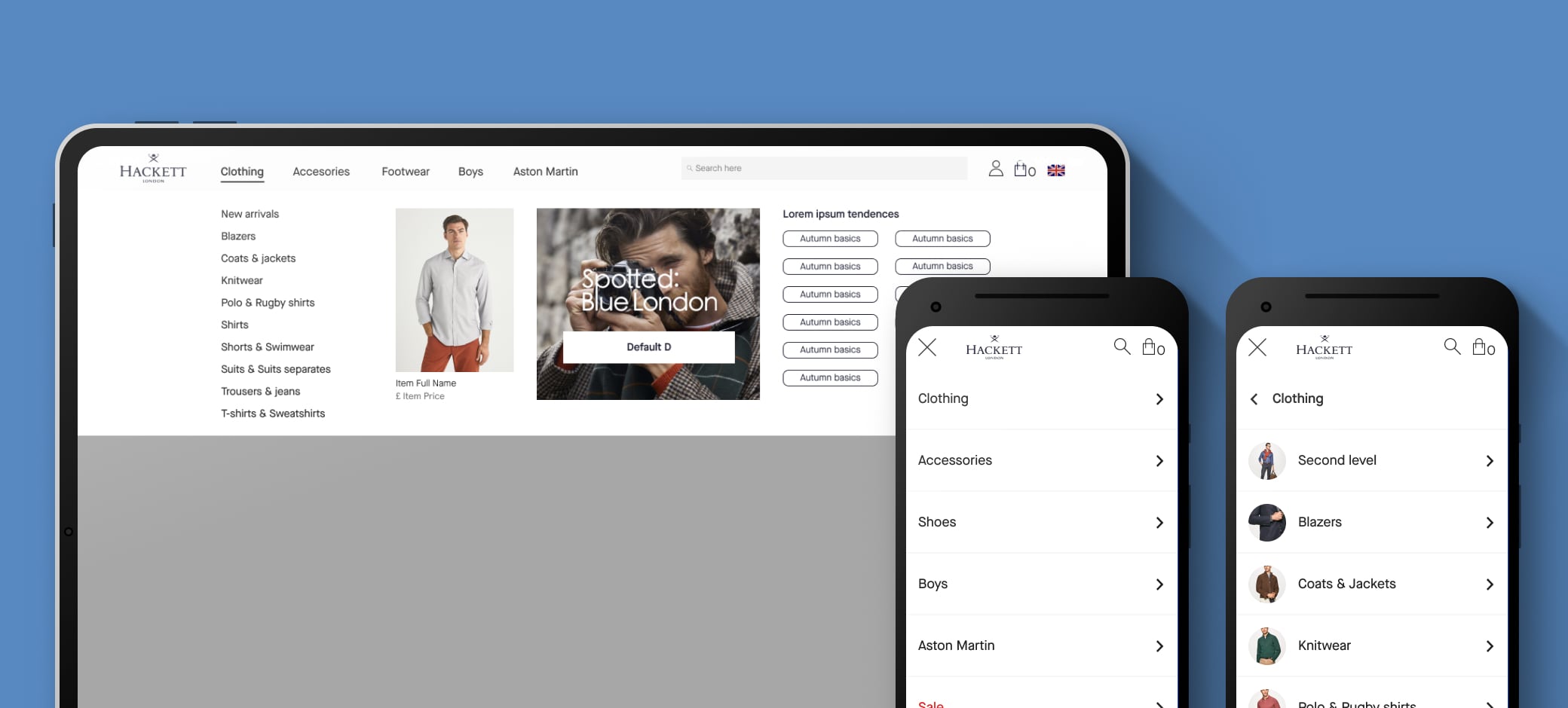
In terms of the navigation model, we established the Hierarchical one for the desktop main navigation in order to organize all the content by building different levels of depth based on the information architecture. It is a common model known by users so they haven’t got any problems in terms of interaction across the site. For mobile devices, we followed the recommendation from the CRO team, which mentioned that one of the weak points that our users experienced on mobile was the navigation based on a mega-drop-down model, which made the user scroll down a lot. Instead of this, we proposed a nested model in order to improve the user experience, because they are more used to this type of navigation on these devices.
In addition we should implement some requiremnts from the different teams:
- Highlight the search bar because users use it to navigate through the site.
- Gain more flexibility for the catalog team to display different categories and navigation levels.
- Give more visibility to country and currency pop-up access.
- Redesign the option to display different content in the main menu: featured product, banners, etc.
- Optimize the height of the nav bar in order to do not occupy more view height than the necessary.
- Mobile navigation based on slide movement between levels (not collapasible items).
This was our proposal:
Despite this is a resume of the whole project, I would like to hightlight the challenge that this project was and the importance that the information architecture and the navigation have in terms of usability and experience.