WeTrash
UX master final project Feb 2020
WeTrash is the final project of my UX/UI Master. It is the result of teamwork, research, creativity, collaboration and continuous learning. Our intention was to build an app to help people recycling by answering their questions and making them learn more.
First, we wanted to know if there was a real interest in recycling and which difficulties they find during this process, so we launched a qualitative survey for 258 users. The 91,6% of the users recycle but more than a half (52,4%) find problems during the process, especially knowing to which container the waste goes as well as finding a close container in the street. According to the results of this study, we decided to focus on these four main points:
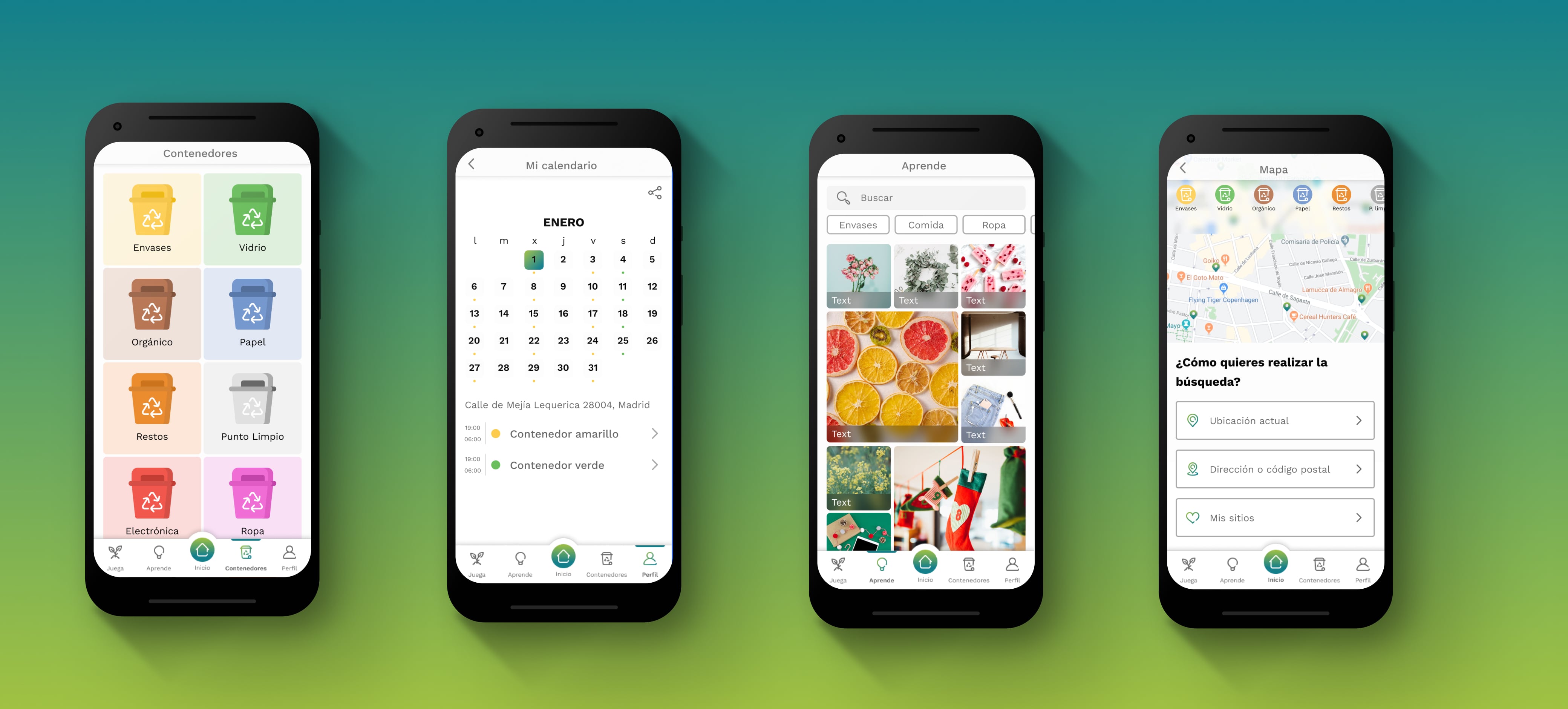
- Recognition and separation of waste
- Container location on map
- Waste collection schedule
- Learning by post and gamification
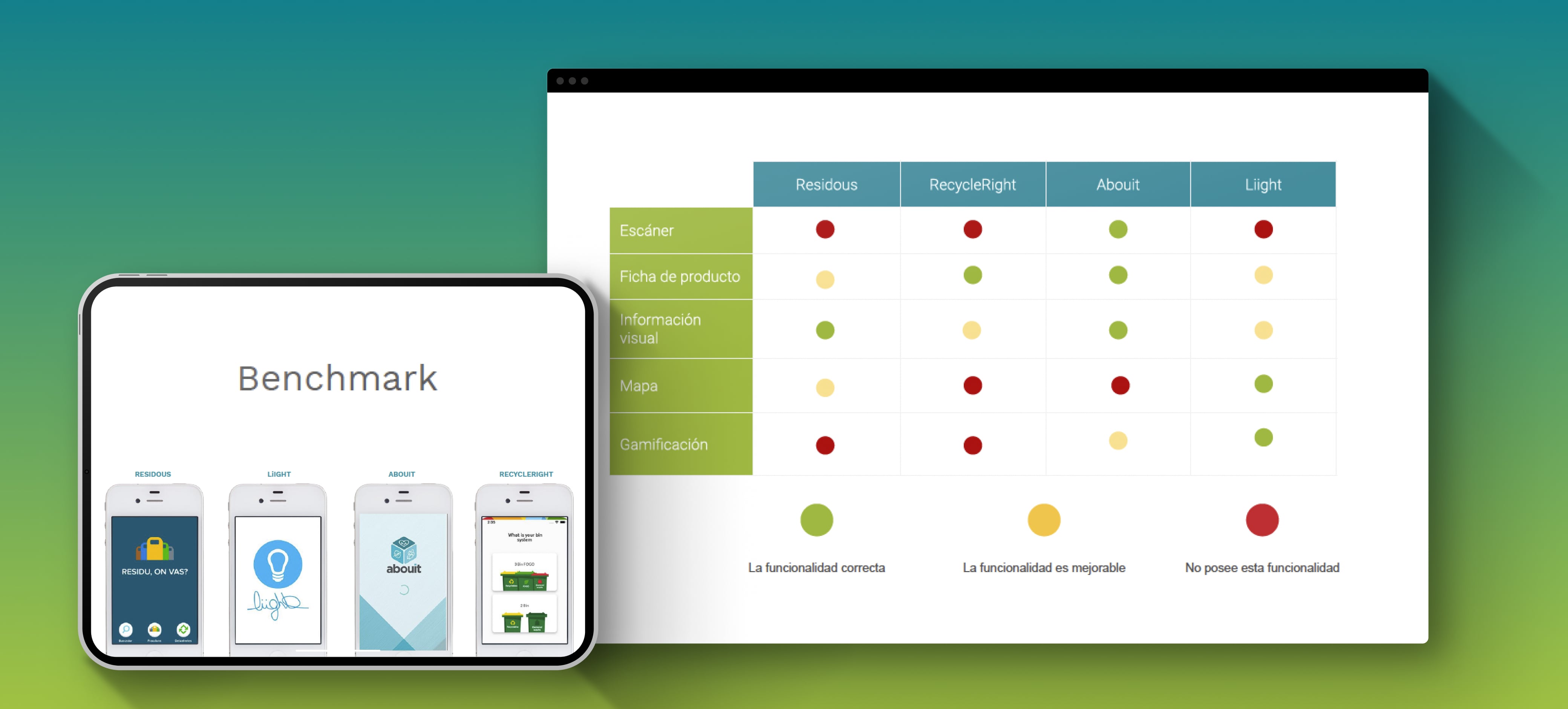
These points were very helpful for us to know where to look at when benchmarking against competitors. We focused our analysis on visual information, image recognition, the product detailed page, containers location and schedule, and gamification.
From the visual perspective, we concluded that the app needed to be connected with the official information from the town hall, so it was important to respect patterns like colors, iconographic trend and simple language to make all the contents accessible.
From the functional point of view, such as taking a photo or searching for a location, the app should be intuitive not only during the checking process but also when displaying the results. Scanner by the camera, complete profile or geolocation system must be the main strengths of this application to stand out from the competition.
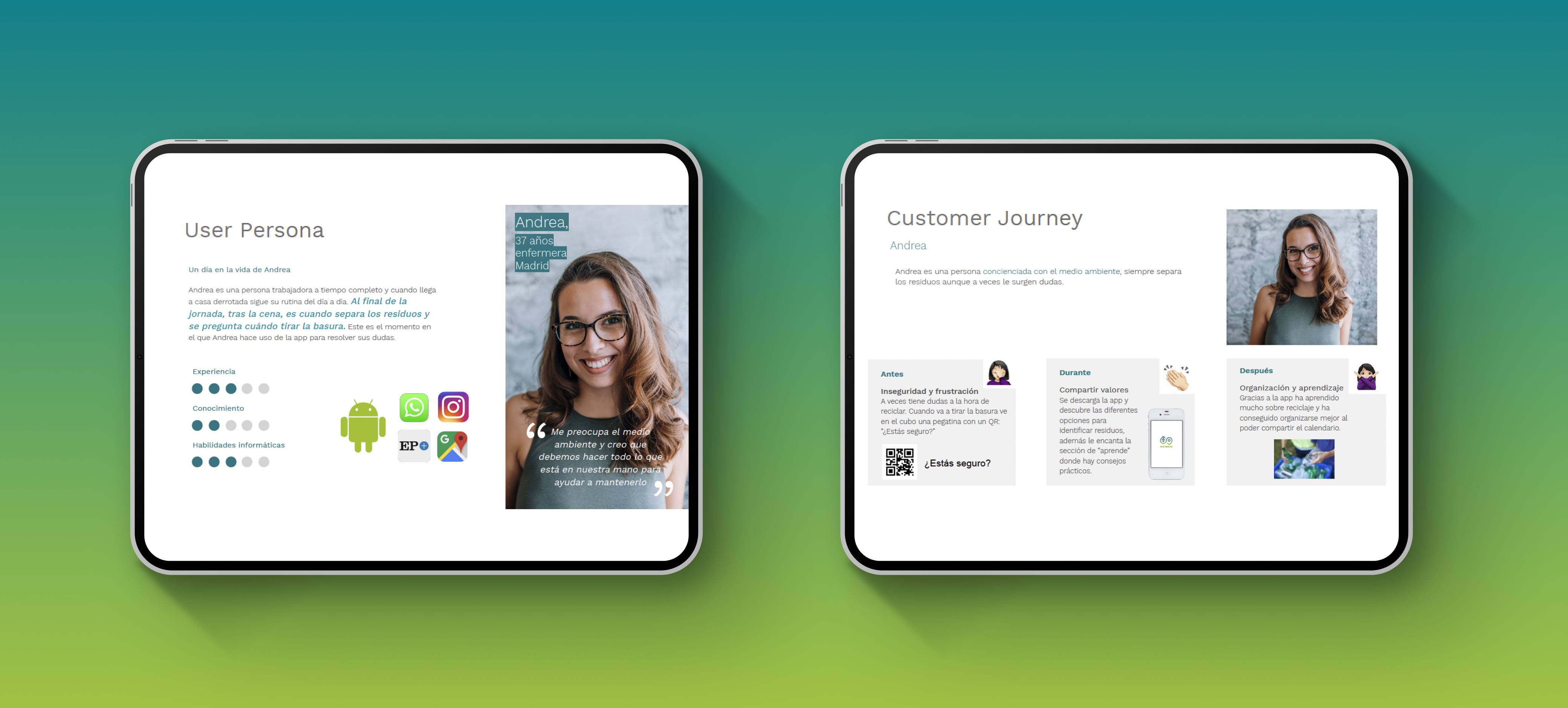
From the beginning we wanted this project to human-centered design human-centered design. For that reason tools like User Persona or Customer Journey are important to connect and empathize with the audience: Who is our ideal user? How does he/she interact with the app?
To answer the first question we used User Persona, which is a fictional representation of our ideal customer. This allowed us to empathize with our target users and identify their needs.
The second question was answered by following the Customer Journey methodology, to evaluate the user experience from the start until the end of the usage of the application.
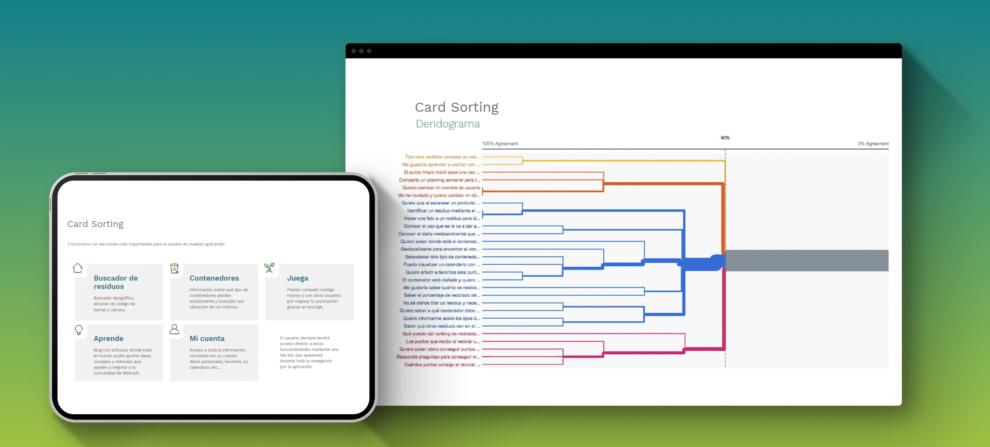
We wanted to create the information architecture under this human-centered perspective, so we organized a hybrid Card Sorting session. Thanks to Card sorting we were able to identify the main categories and to group and unify ideas.
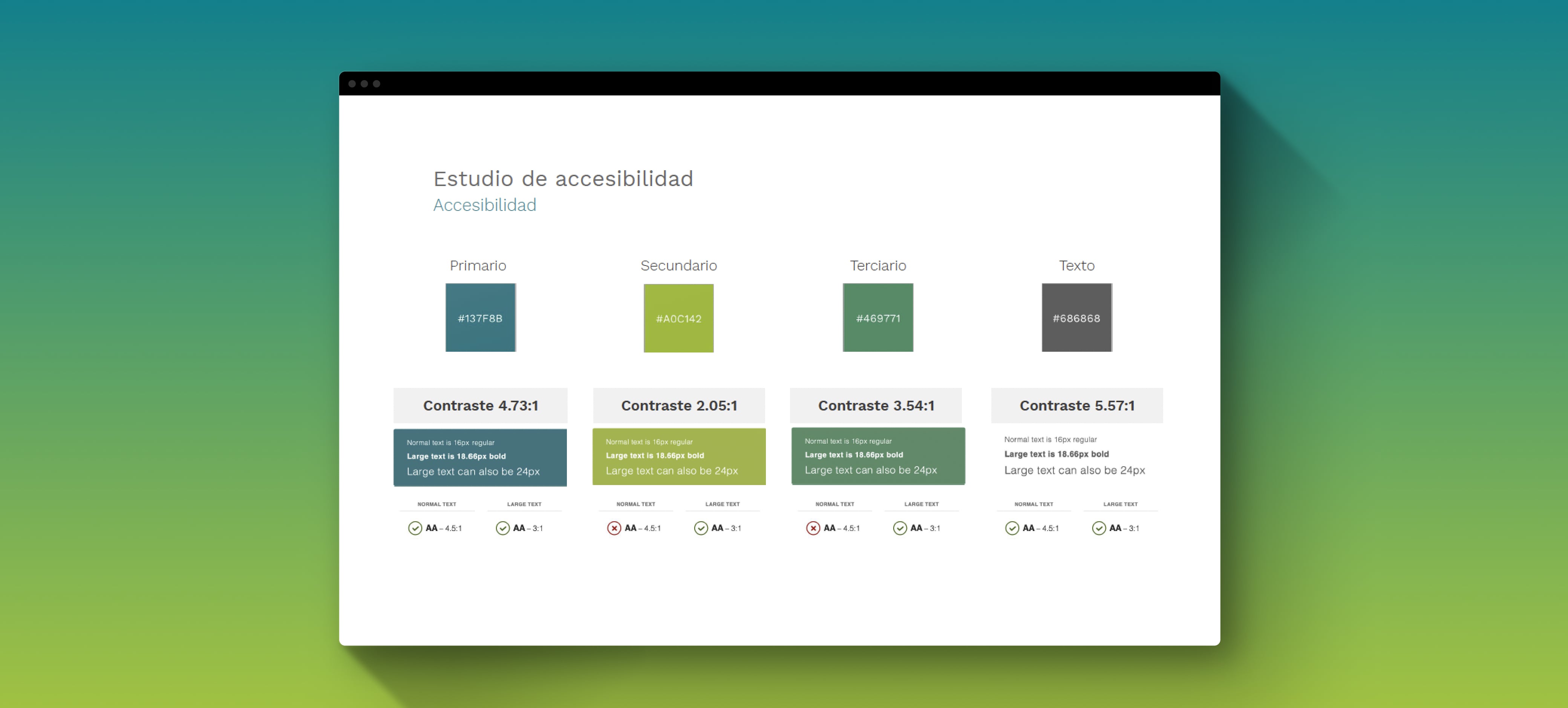
We take the accessibility very seriously, so we made sure that we were accomplishing the Web Content Accessibility Guidelines (WCAG) in terms of colour, typography, spaces, etc.
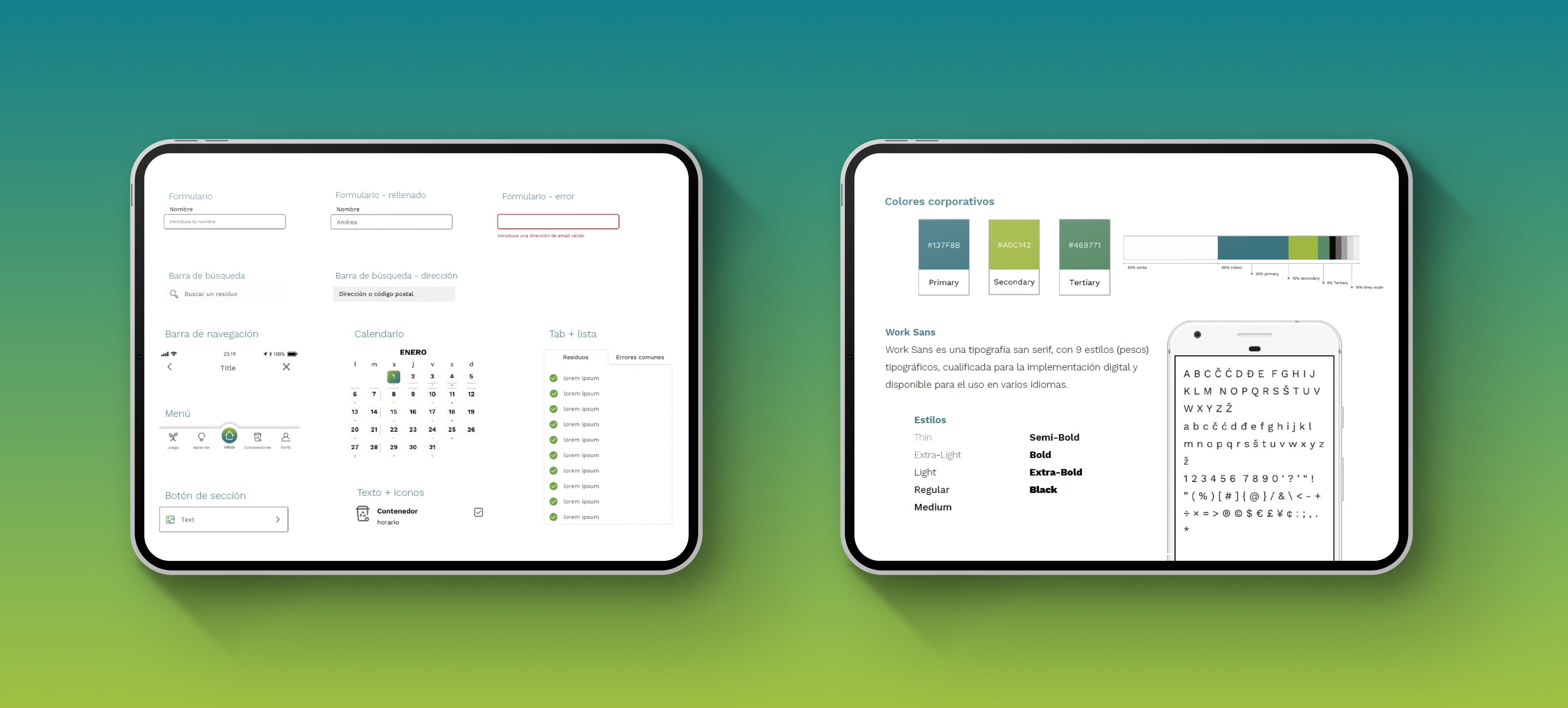
We implemented a robust Design System based on modular and reusable components.
At this point, we were ready to launch an interactive prototype as a beta version for some users. With this we wanted to know whether:
- The users were able to identify the purpose of the app (Five second test)
- The users were able to easily find the map and look for the closest container (First click test)
- The users were able to go easily through the process of categorizing the waste by using the camera scanner (Navigation test)
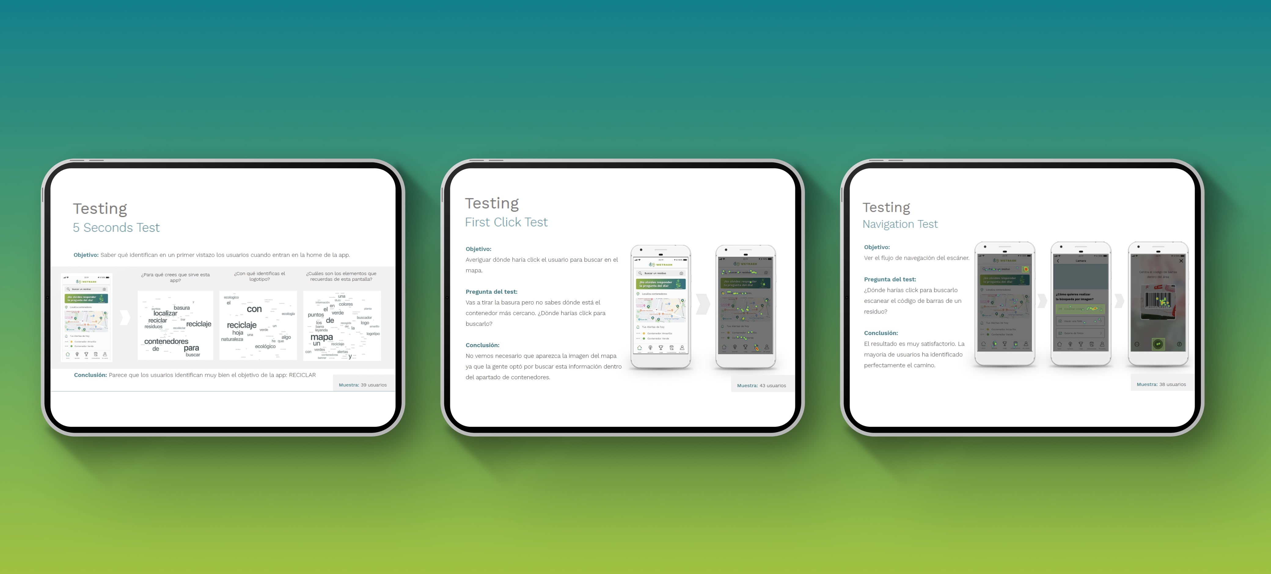
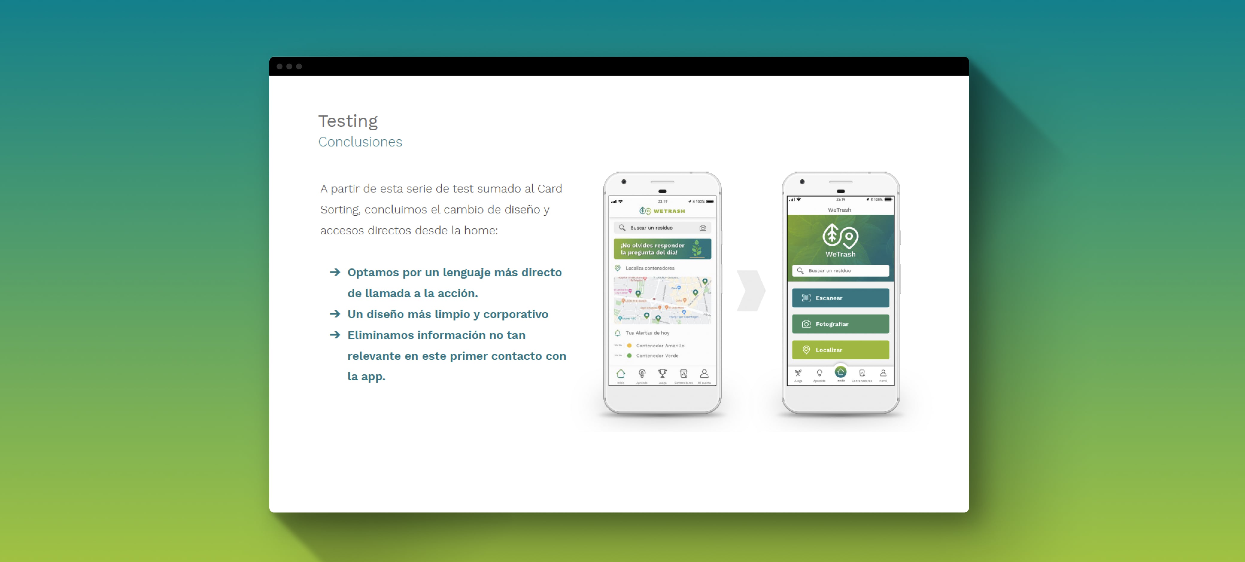
After performing these tests, we realized that we needed to change the home page.
This was my first UX/UI project, a whole process to engage myself in this discipline.
Contact
Let's keep in touch!