Pepe Jeans product listing page redesign
Mar 2020
The objective of this project was to improve the conversion and the user experience in the product listing page. The E-commerce team analyze user behavior by data like average purchase time from this page, bounce rate, scroll percentage or the number of clicks until finish the purchase process. Besides they wanted to introduce some functionalities like quick shop, wishlist or dinamic grid.
According to this information we focused this project in differents parts:
- Filters
- Grid
- Product images
- Quick buy
- Wishlist
This was the PLP before the redesign:
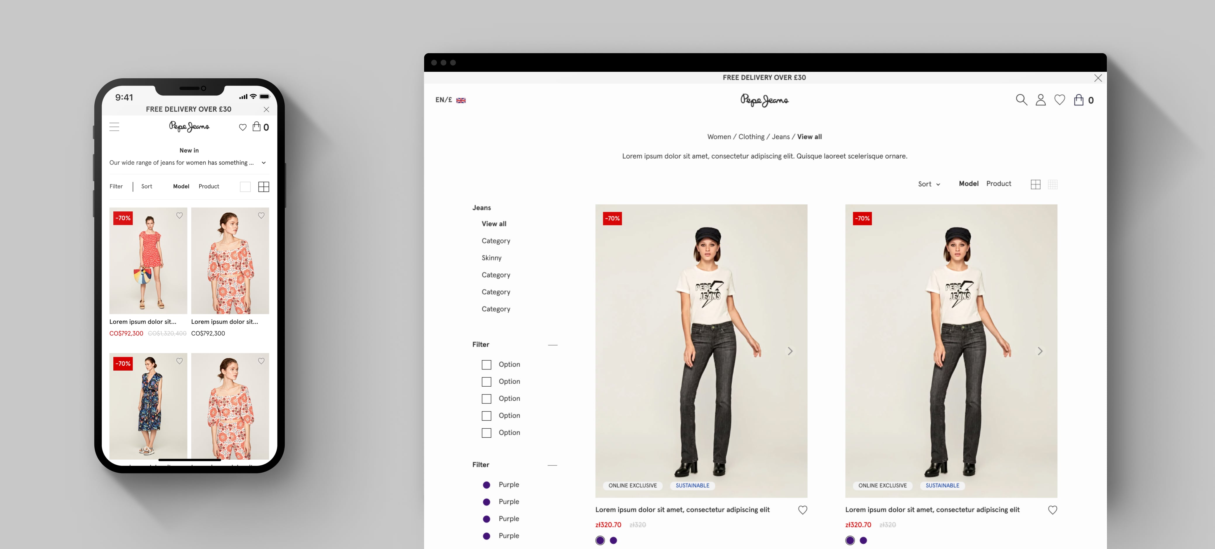
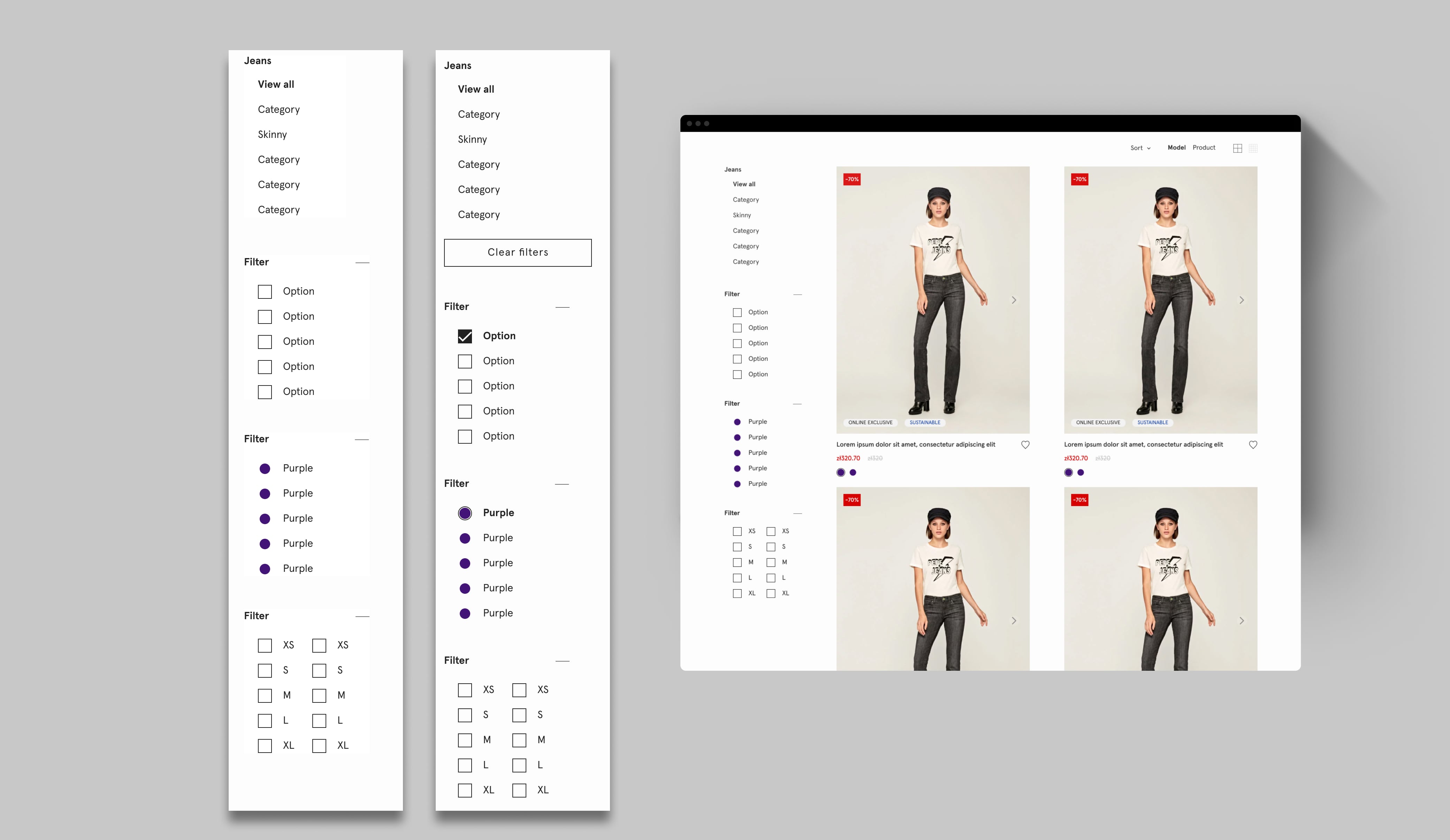
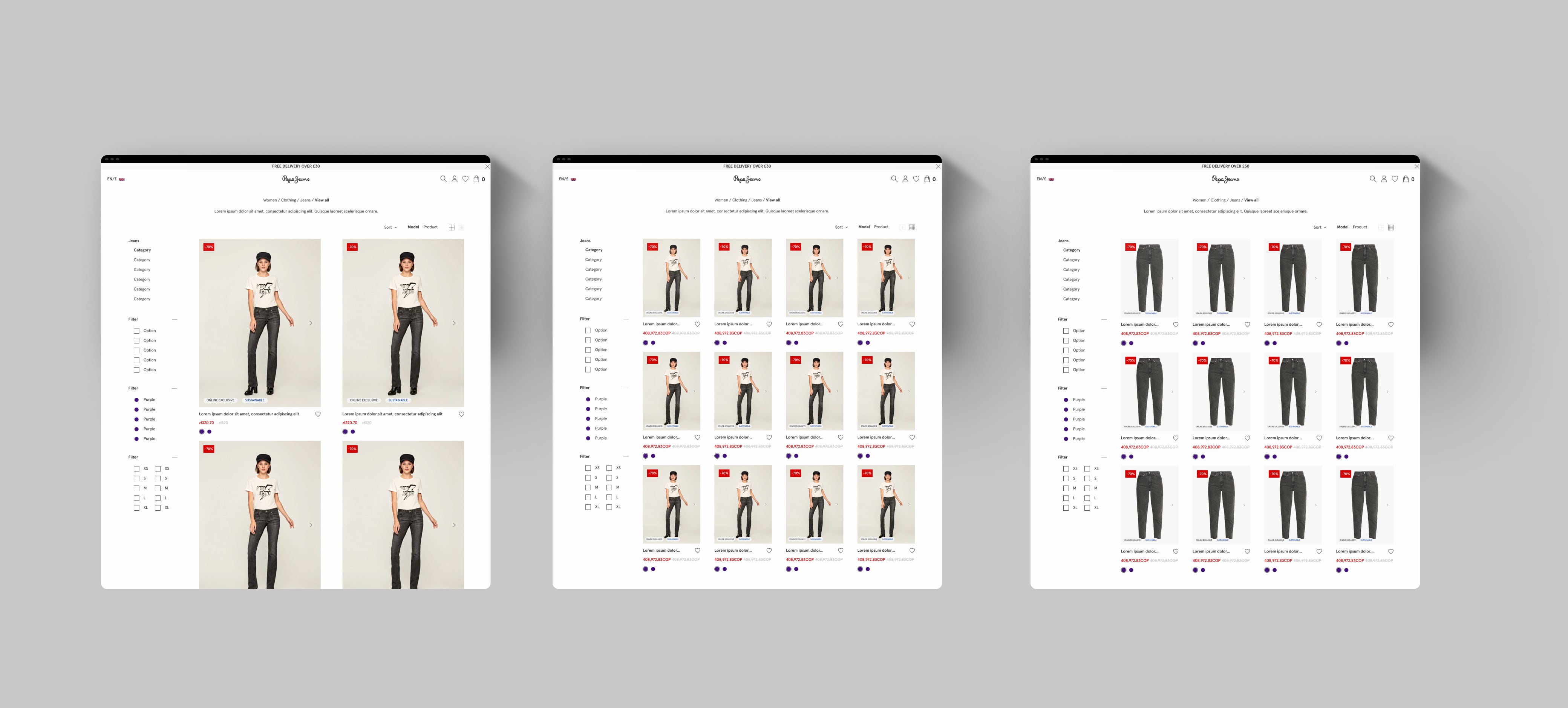
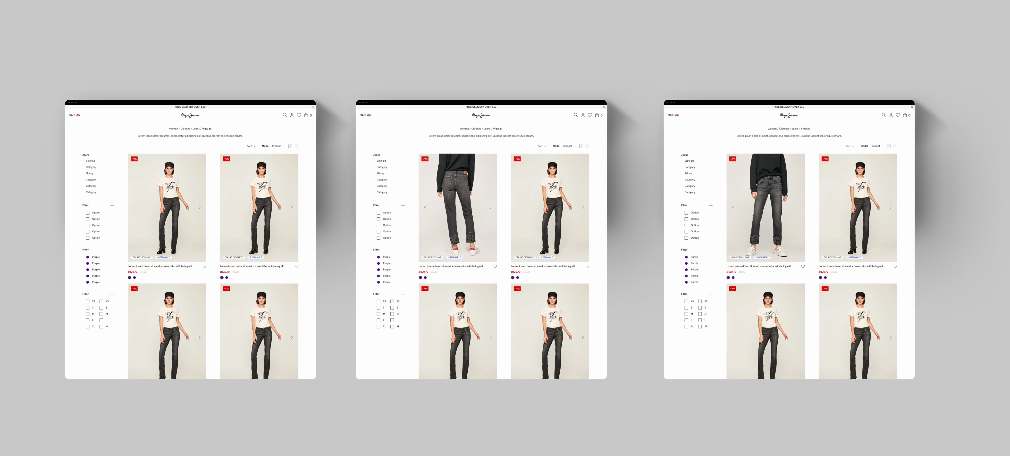
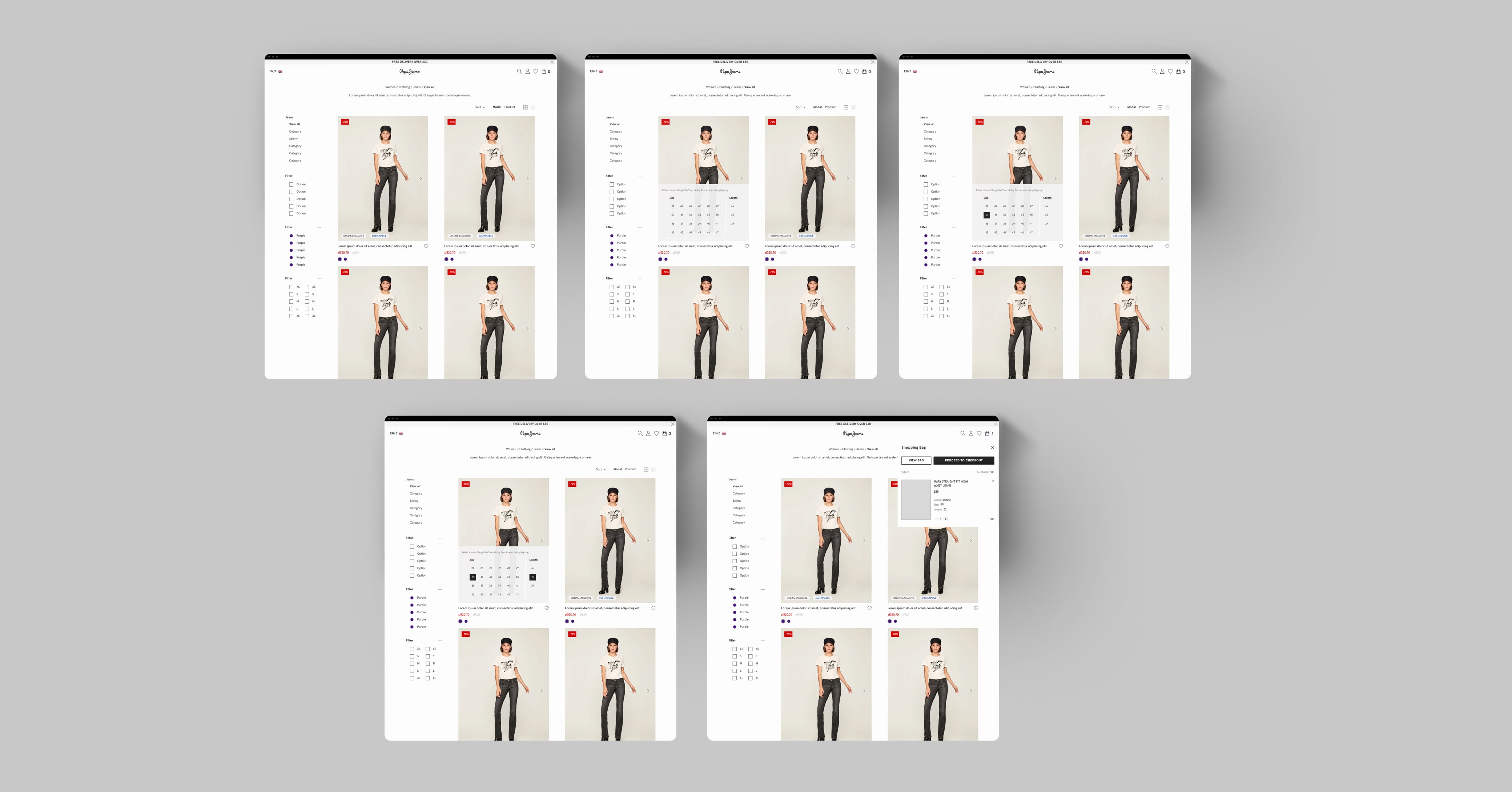
FFilters were the first challenge because they generated frustration to the users due to top right postion and their sticky behavior. When there were more filters they could occupy two lines in desktop devices, so the space for the product (the most important) in the screen was very reduce.
Following the E-commerce and the CRO data, we proposed a left sticky sidebar which included the fourth navigation level and multi-select filters. There were product categories with more filters than usual for this reason it was important to introduce a collapse behavior in each group of filters.
The "clear filters" button was a requirement from the E-commerce team because they wanted to give to the user this option to reduce the number of clicks. This button only appears if there is some filter selected.
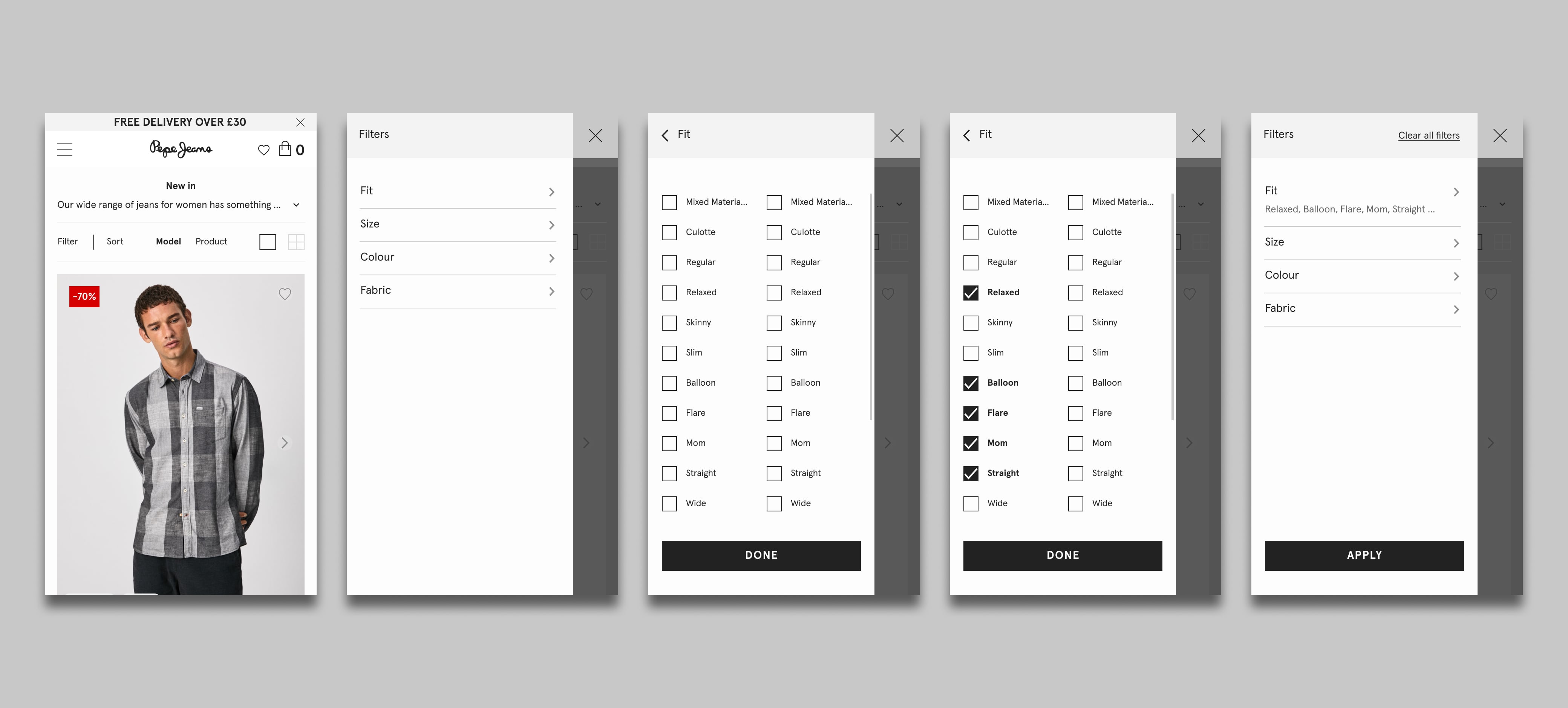
On mobile we replicated the navigation behavior by layers but changing the arrangement of the layers to the left and unify visual styles between desktop. Despite the fact that mobile traffic is almost 80%, in filters the greatest modifications occurred on desktop. In mobile the conversion rate, etc. they were good and from the e-commerce team they did not see it necessary to make too many changes.
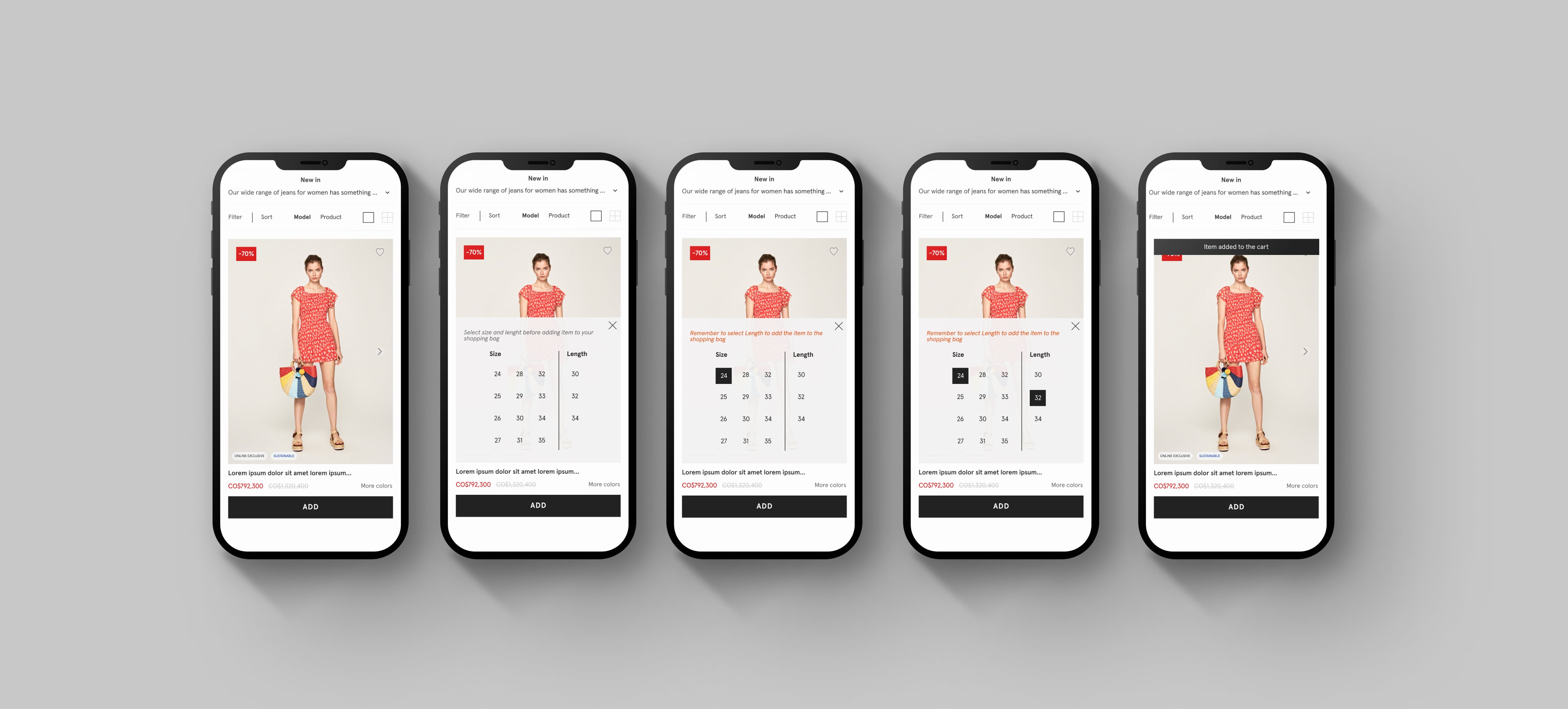
The dinamic grid was one of the most difficult part of this project. The objective was allow users choose the product visualisation between 2 or 4 columns per row, between product or model view, etc. In this part, the important thing was that any visualization chosen by the user and any device never presented the incomplete product image, something that happened in some resolutions with the old design.
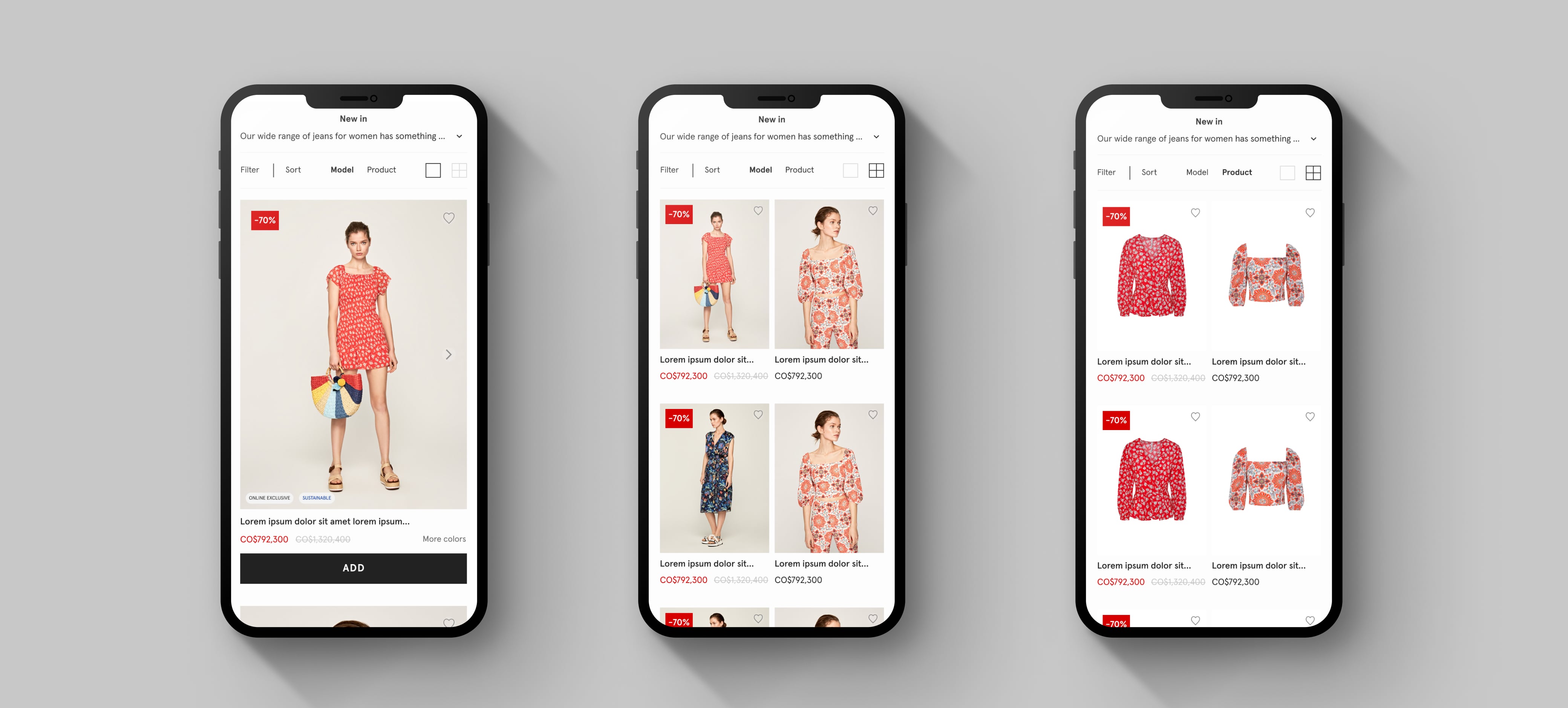
The product image carousel was another improvement in the PLP over the previous version. This allows the user to view all the images without going to the product description page, which is very useful for a quick shop, which we will explain later.
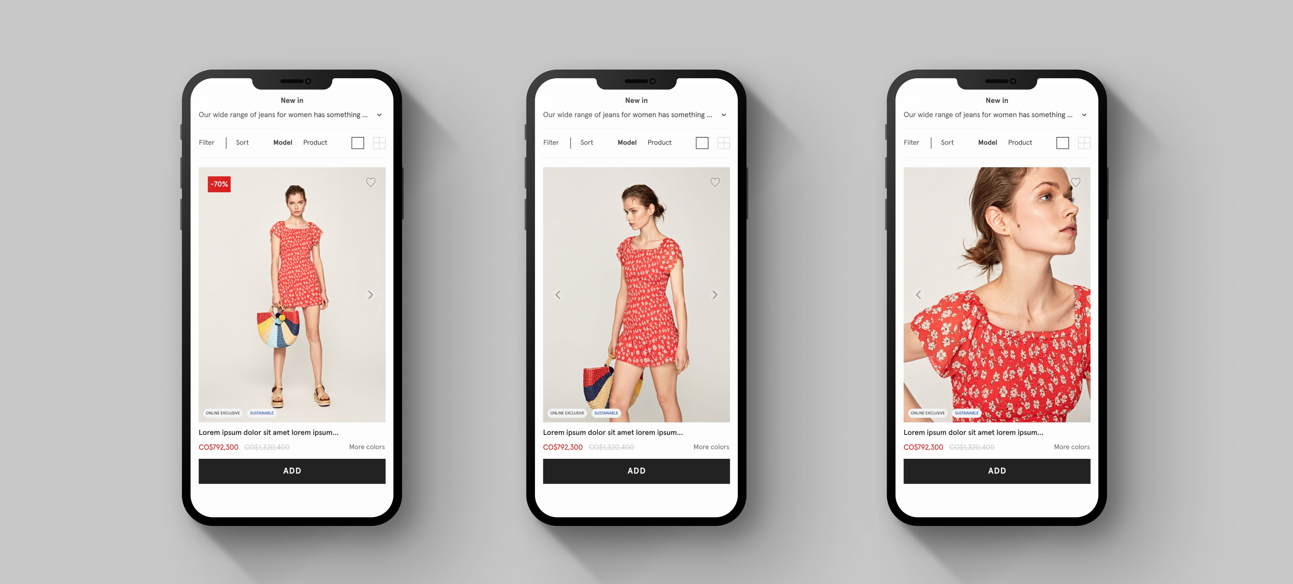
The quick shop was the clearest improvement to E-commerce team because according to their data it would significantly increase sales and with them the benefits. This process has to have the least number of clicks possible, trying not to be too invasive for users. Furthermore, as it is a critical part of the conversion funnel, it must be clear and easy for the user to complete the action of bringing a product to the cart.
As a designer, this project was a great challenge for several reasons. First, I had just finished a master in UX / UI design, so I did not have enough experience to face it, however I did it and learned a lot during the process, for example, in tools like Sketch, Invision, etc., but also in the way of working with other teams that do not have the same vision as you. Internal teamwork is also very important for the discussion, coordination and development of files and deliverables.
Contact
Let's keep in touch!